An outdoor vinyl banner is a successful way for many businesses to grow their visibility and attract customers. There are times when a custom vinyl banner does not have the proper design which means it will likely not deliver the desired results. In many cases, this can be avoided by making sure some simple design errors do not happen during the design and production process.
In this article, we will highlight the top custom outdoor banner design mistakes to avoid so you can gain the ROI you want from your banners.
Size of Text & Graphics
While this seems like a simple part of the design process, it is not always executed correctly. When it comes to the viewing distance of the signage, the banner needs bigger text and graphics if it is being viewed from a far distance. If the person is viewing the outdoor vinyl banner from a closer distance, the design should have smaller text and graphics. The viewing distance must be considered or the custom vinyl banner can be difficult to read.
Too Cluttered or Busy
If a custom outdoor banner is too cluttered or too busy because of too many design elements fighting for attention, the readability of the banner can be seriously impaired.
Take a look below at some of the most common mistakes that can happen during the design process:
- Letter and graphic spacing needs to be designed to be appealing and understandable instead of being so close together that the banner is hard to read.
- A font style that is fancy or abstract might seem great in theory but it can make the text hard to read or decipher.
- A font weight that is too thin can be hard to read and lessen the desired impact of the message.
- An image resolution that is too low can be dull or fuzzy which makes it difficult to view the image and make out what it means or represents.
Avoid Misspelling & Typos
This seems like such an obvious mistake to avoid but it happens more often than you might imagine. The appearance of misspelled words on your banner design takes away from your professional image. It can also make the message hard to understand and even give incorrect information.
Using the Wrong Colors
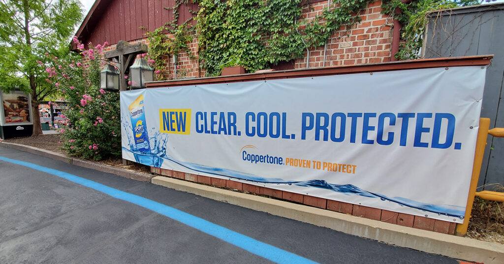
The correct use of color is an important aspect of banner design. The color that you choose catches the eye so try to use a color that best identifies your business while still making the banner appealing and easy to read. Color contrast is also important so think about using a dark text on a light background or light text on a dark background.
Coating Consideration
If you don’t use a coating finish on your banner, you can potentially shorten the lifespan and effectiveness of the banner. There are multiple reasons to use a coating including the fact that it increases the durability of the banner and makes it easier to maintain. A banner coating can prevent any damage from the sun and also make it easy to clean off any dust, dirt, or grime that gets on the banner.
Want to make sure your outdoor banner is long-lasting and easy to read? Contact our design team today.
Contact Us Now for More Information
Phone: (314) 652-9924